A display’s contrast ratio plays an important role in image quality and readability, but it does not tell the whole story. A panel with an excellent contrast ratio on paper may still perform poorly in a bright factory, 屋外キオスク, or industrial control room if brightness, reflections, and optical integration are not properly considered.
This guide explains what contrast ratio really means for touch displays, why datasheet specifications often differ from real-world performance, and how factors such as panel technology, 輝度, 光ボンディング, and ambient light work together to determine display readability.
What Is Contrast Ratio for Touch Displays
Defining Contrast Ratio: Static vs. Dynamic
Contrast ratio measures the difference between the brightest white and darkest black a screen can show, written as a ratio like 1000:1. This means the white is 1000 times brighter than the black. But not all ratios are created equal. Static contrast is the real number that matters; it’s the contrast measured within a single image at one moment, representing the display’s true hardware capability.
Dynamic contrast, 一方で, is a marketing gimmick. It uses backlight tricks over time to generate a wildly inflated number. For any industrial or professional touch application, this metric is unreliable and should be ignored. Always focus on the static (or native) コントラスト比.
Impact on Readability and User Interaction
Higher contrast creates deeper, inkier blacks and crisper whites, which makes text, icons, and small UI details much easier to read. For an HMI or control panel, good contrast helps an operator quickly distinguish between active and inactive buttons, reducing the chance of critical input errors. When contrast is low, the image looks washed out, details in dark areas get lost, and the user experiences more eye strain and frustration.
How Panel Technology and Integration Affect Contrast
The underlying LCD technology sets the baseline for contrast. VA panels typically deliver much higher native contrast (2000:1 以上) compared to IPS panels (around 1000:1). But the panel itself is only part of the story. The complete optical stack—including the touch sensor, cover glass, and any coatings—adds layers that can create reflections and reduce the effective contrast the user actually sees.
This is where integration methods like optical bonding make a huge difference. By eliminating the air gap between the display and the touch sensor, optical bonding cuts down on internal reflections. This significantly boosts the final perceived contrast and improves readability, 特に明るい環境では.
The Role of Ambient Light on Effective Contrast
A display’s official contrast ratio is measured in a dark room, a condition that rarely exists in the real world. In practice, light from overhead fluorescents or nearby windows reflects off the screen’s surface. This reflection raises the black level—turning deep blacks into murky grays—and crushes the effective contrast. For any タッチディスプレイ used outdoors or in a bright factory, maintaining legibility requires a system approach: a high-contrast panel combined with high brightness and effective anti-reflective coatings.
Why Lab Specs and Real-World Visibility Are Not the Same
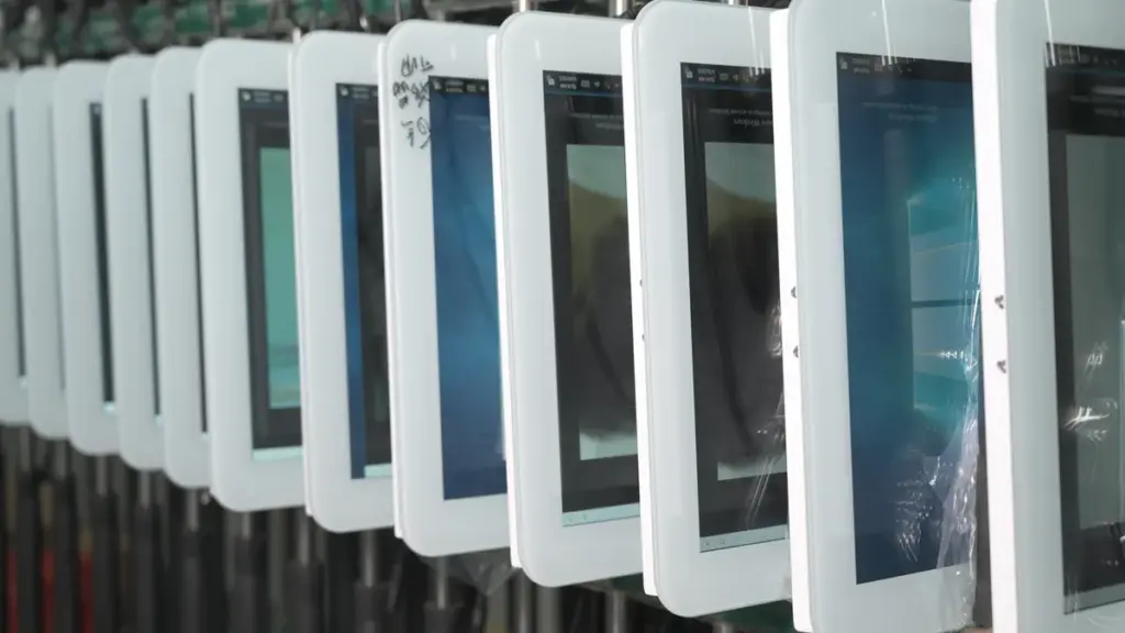
Datasheet contrast specs are measured in a perfect, dark lab. Real-world visibility is dominated by ambient light, reflections, and the touchscreen’s layers, making lab numbers almost irrelevant.
The Idealized Conditions of Lab Measurements
The contrast ratio you see on a datasheet is a lab-grade number, not a field-ready one. Technicians measure static contrast—the difference between the brightest white and the deepest black—in a completely dark room to eliminate any external light. The measurement is taken straight-on, perpendicular to a perfectly clean screen. This pristine setup captures the absolute best-case electro-optical performance of the display panel itself. It purposefully ignores all the messy, real-world factors like ambient light, glare, and surface grime that define a user’s actual experience.
How Ambient Light and Reflections Alter Contrast
Out in the real world, ambient light is the great equalizer of display specs. Light from windows and overhead fixtures reflects off the display’s surface, which instantly raises the brightness of the “黒” pixels. This washes out the image and collapses the effective contrast ratio, regardless of the impressive number on the spec sheet. A display with low surface reflectance will have much better visibility than a highly reflective one, even if their lab contrast ratios are identical. Performance in the field isn’t about lab contrast; it’s about *ambient contrast*, which is a measure of how well a display holds up against reflections.
The Impact of the Touchscreen Optical Stack
A touchscreen isn’t just a display panel; it’s an entire optical assembly. Adding layers like cover glass and touch sensors introduces new surfaces, and each one creates an opportunity for reflection. Air gaps between these layers are particularly bad, as they amplify internal reflections and kill contrast. This is why optical bonding, which fills those gaps with a clear adhesive, is so critical for boosting visibility in bright conditions. Specialized coatings like Anti-Reflective (AR) and Anti-Glare (AG) also play a massive role, but these are properties of the finished stack-up, not the underlying display panel whose spec you read first.
Human Interaction and Viewing Dynamics
Lab tests assume a static, perfect viewer. People are anything but. We look at screens from different angles, and on many display types, contrast and color quality drop sharply when you move off-axis. Then there’s the physical interaction. Fingerprints, 汚れ, and oils on a touch surface scatter light, create localized glare, and degrade readability in ways a lab meter never sees. For outdoor or vehicle displays, even the user’s sunglasses can be a problem. Polarized lenses can interfere with the display’s own polarizers, sometimes blacking the screen out entirely from certain angles.
Get Reliable, Custom Touchscreens Shipped Fast
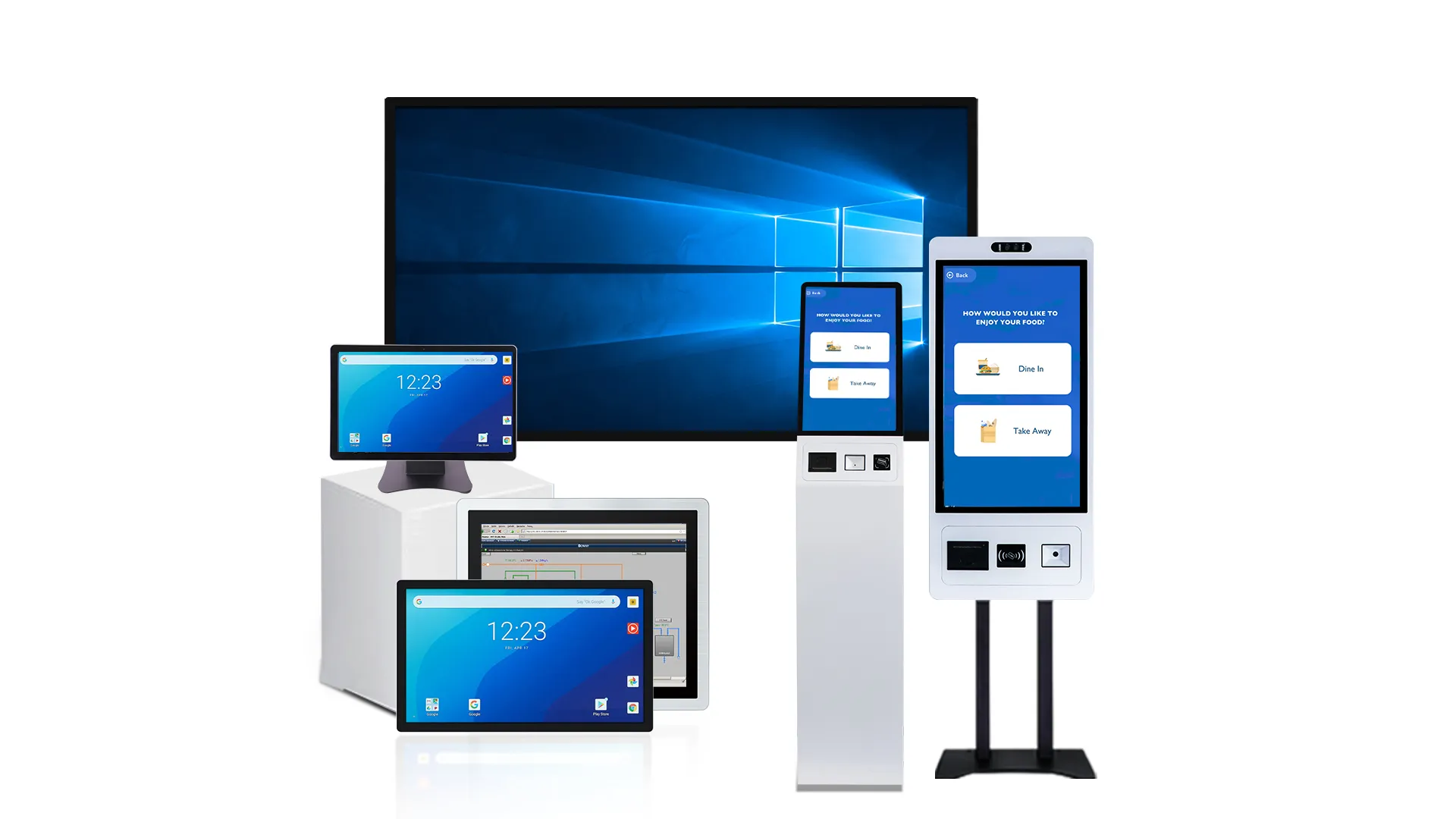
How Brightness, パネルタイプ, and Ambient Light Affect Contrast
Usable contrast isn’t just a spec sheet number. It’s a battle between a display’s native brightness and panel type against the washout effect of ambient light.
The Role of Brightness in Maintaining Usable Contrast
To prevent an image from looking washed out, a display’s brightness (luminance, measured in nits) must overpower the ambient light hitting the screen. In bright conditions, light reflects off the display surface, which raises the effective black level and makes dark colors appear gray. This compresses the visible difference between light and dark tones. A good rule of thumb is that a display’s luminance should be at least five times greater than the ambient light it’s competing with to maintain a clear, high-contrast image.
How Panel Technology Determines Native Contrast
The underlying panel technology sets the maximum possible, または “native,” 対比. Panels like OLED and VA are known for high native contrast ratios (から 2,000:1 to near-infinite), which allows them to produce deep, true blacks in controlled lighting. 対照的に, IPS and TN panels, while popular for their wide viewing angles or lower cost, typically have lower native contrast around 1,000:1. But a panel with a high native contrast is only as good as its ability to be seen. Its advantage is severely diminished in bright environments if the display lacks sufficient brightness and effective anti-reflection optics to fight glare.
Ambient Light: The Dominant Factor in Real-World Performance
Ambient light is the primary reason why a display’s real-world performance rarely matches its lab-tested specs. It degrades contrast in two main ways: through direct surface reflections that cause glare, and by scattering light within the display’s protective layers, which washes out the image. For any display intended for use outside a dark room, the Ambient Contrast Ratio (ACR) is a far more meaningful metric than native contrast. ACR accounts for the impact of reflected light, giving a realistic measure of readability in the intended environment.
Impact of the Touch-Display Optical Stack
Touch displays introduce more complexity. The additional layers needed for touch functionality, like the cover glass and the touch sensor itself, create more internal surfaces where light can reflect and degrade contrast. Engineers solve this problem with optical bonding, a process that uses an adhesive to eliminate the air gaps between these layers. This significantly reduces internal reflections and improves contrast in bright light. To further protect the image, anti-reflective (AR) そしてアンチグレア (AG) coatings are applied to the outermost surface to minimize reflections and preserve as much of the panel’s native contrast as possible for the user.
Which Projects Need Higher Contrast and Which Do Not
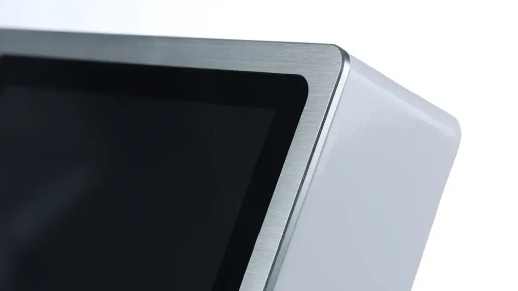
The right contrast ratio isn’t always the highest one. It’s about matching panel performance to the real-world environment, the task, and the budget.
Choosing the right display contrast isn’t just a spec sheet comparison; it’s a practical decision based on where and how the screen will be used. A panel that looks great in a dark room might be unreadable outdoors, while an expensive high-contrast display could be overkill for a simple indoor controller.
Applications Requiring Higher Contrast
In certain applications, high contrast is non-negotiable. This is typically true where ambient light is a major factor or the information displayed is absolutely critical.
- Outdoor and Sunlight-Readable Systems: EV充電器, 発券キオスク, and fuel pumps need high contrast and brightness (1500+ nit) to remain legible in direct sunlight. Anything less gets washed out completely.
- Critical Information and Safety Displays: Medical monitors, industrial HMIs, and aviation panels rely on high contrast for unambiguous readability of vital data. There is no room for misinterpreting a warning or a reading.
- High-Fidelity and Premium Visualization: Automotive digital cockpits, professional design monitors, and luxury retail displays use high contrast to deliver deep blacks and a superior visual experience that reflects the product’s quality.
- Large Public Touchscreens: Interactive walls in bright museums or transport hubs require strong contrast so content is clear from both near and far viewing distances, overcoming complex ambient lighting.
Applications Where Standard Contrast Is Sufficient
For many common projects, especially in controlled environments, a standard-contrast panel provides excellent performance without the added cost of a premium display. Good UI design often matters more here.
- Indoor Self-Service and Kiosks: Terminals in controlled lighting like hotel lobbies, オフィス, or clinics perform well with standard 800:1 に 1200:1 contrast panels.
- Office and Classroom Collaboration: For interactive whiteboards, consistent wide viewing angles and effective anti-glare coatings are often more critical than pushing panel contrast to its limits.
- Embedded and Hobbyist Panels: Smart home dashboards, 3D printer UIs, and other small control panels for indoor use do not require premium, high-contrast displays to be effective.
- Simple Informational Displays: Room booking panels and reception check-in pads in moderately lit corridors can achieve excellent clarity through good UI design on a standard panel.
When to Prioritize Other Factors Over Panel Contrast
時々, chasing the highest contrast ratio leads to a poor overall design. Other factors can have a much bigger impact on the final user experience, especially when dealing with real-world constraints.
- Brightness and Reflection Control: For outdoor use, high brightness combined with optical bonding and anti-reflective coatings often provides a greater readability boost than contrast ratio alone.
- Viewing Angle Consistency: In collaborative settings, a display that maintains its color and contrast from wide angles (like IPS) is more practical than one with a higher on-axis contrast that shifts off-axis.
- UI Design and Software Contrast: The programmed contrast between text and background elements in the user interface is a critical factor that directly impacts legibility, regardless of the panel specs.
- 力, Thermal, and Cost Constraints: Extremely bright, high-contrast displays consume more power, generate more heat, and cost more, making them impractical for battery-powered or budget-sensitive projects.
How B2B Buyers Should Compare Contrast Ratio in Sourcing
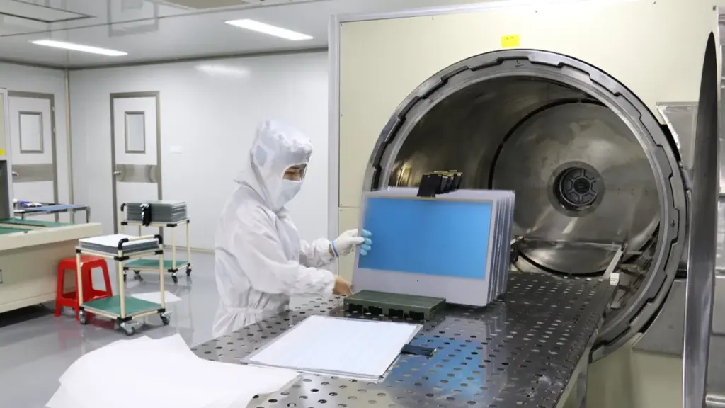
Effective sourcing depends on static contrast, panel technology, and system design—not inflated marketing specs. Analyze how the display performs in your specific application environment.
| Evaluation Criteria | Key Sourcing Considerations |
|---|---|
| Static vs. Dynamic Contrast |
|
| Panel Technology |
|
| 環境 & System Design |
|
| 申請要件 |
|
| Supplier Specification Framework |
|
なぜ touchwo Focuses on Project-Fit Display Tuning
Why Datasheet Contrast Ratios Don’t Guarantee Readability
The contrast ratio printed on a spec sheet is almost always a static measurement taken in a pitch-black room. This controlled setting has no resemblance to a factory floor, a sunlit vehicle cabin, or a brightly lit retail space. As soon as you introduce real-world ambient light, reflections from the display surface dramatically raise the black level. This washes out the image and crushes the effective contrast that the user actually sees. A panel with a high 1000:1 datasheet rating can deliver poor, unreadable performance if it isn’t properly tuned for its operational environment.
Adapting Displays for Specific Environments and Applications
Different applications demand different optical characteristics. Industrial and commercial settings are often flooded with high ambient light, which requires higher brightness and effective glare control to remain legible. The requirements for a medical display needing subtle grayscale differentiation are completely different from a rugged HMI where bold legibility is the priority. Project-fit tuning ensures the final product meets its specific goals, including crucial accessibility standards like the WCAG 4.5:1 text contrast ratio for clear and effective communication.
Customizing the Entire Optical and Electrical System
Achieving true readability involves tuning the entire system, not just selecting a panel. We start by choosing the right panel technology—IPS, バージニア州, or TN—to balance the project’s specific needs for contrast, 視野角, and cost. それから, we optimize the complete optical stack, which includes surface treatments like anti-glare (AG) or anti-reflective (AR) coatings that preserve contrast in the field. We also adjust the backlight brightness and LCD drive voltages to deepen black levels and ensure the display delivers crisp clarity in its target environment.
Compensating for the Impact of Touch Integration
Integrating touch technology fundamentally changes a display’s optical properties. The addition of touch sensors and cover glass introduces extra layers that reduce light transmission and increase internal reflections, degrading the panel’s native contrast. Our tuning process specifically compensates for these optical losses to restore the intended visual performance. We also select surface treatments that minimize the visual impact of fingerprints and smudges, a constant issue in interactive applications that can further reduce perceived contrast.
最終的な考え
Contrast ratio is an important display specification, but it should never be evaluated in isolation. Real-world readability depends on the combined performance of panel technology, 輝度, ambient lighting conditions, 光ボンディング, および表面処理. Looking beyond datasheet numbers helps ensure the display performs reliably in its intended environment.
For industrial and OEM projects, selecting the right display means balancing optical performance, 耐久性, power consumption, and project cost. Evaluating the complete display system—rather than a single specification—results in a better user experience and a more reliable product throughout its service life.
よくある質問
What is a good contrast ratio for a touch display in 2026?
A static contrast ratio of 1000:1 is considered a good minimum for modern touch displays. For general-purpose indoor use, 2000:1 に 3000:1 provides strong performance. For applications in bright or demanding environments, a ratio of 3000:1 or higher is desirable to maintain clarity.
Why does contrast ratio matter for kiosks and HMIs?
Contrast ratio is crucial for kiosks and HMIs because it directly impacts readability in real-world lighting. のために public kiosks, it ensures users can quickly read menus and instructions. 産業用HMI向け, high contrast allows operators to instantly recognize critical alarms and machine status, which improves safety and efficiency.
Is a higher contrast ratio always better?
Not necessarily. While a higher static contrast ratio improves image quality in controlled environments, its practical benefit depends on other factors. In bright rooms or outdoor settings, a display’s brightness and anti-reflective properties can be more important for maintaining readability.
How does ambient light affect a display’s perceived contrast?
Ambient light reduces perceived contrast by reflecting off the screen’s surface. This reflection adds light to the darkest parts of the image, making blacks appear gray and washing out the overall picture. This is why anti-reflection coatings and high brightness are critical for displays used in well-lit areas.
What is the difference between contrast ratio and brightness?
Brightness is the absolute amount of light a display emits, measured in nits (cd/平方メートル). It determines how well a screen can be seen in bright environments. Contrast ratio is the relative difference between the display’s brightest white and darkest black. A display can be very bright but have poor contrast, which would make its image appear washed out.
How should I compare contrast ratio specs for a project?
Focus on the ‘static’ or ‘native’ コントラスト比, as ‘dynamic’ ratios are often inflated for marketing. Compare this number alongside the display’s brightness (nit) and consider the intended environment. For bright areas, prioritize a balance of high brightness, effective anti-reflection coatings, and a strong static contrast ratio (例えば, 3000:1 or higher).