Color gamut determines the range of colors a touch display can reproduce, directly affecting how accurately images, インターフェース, and brand visuals appear on screen. しかし, a higher color gamut does not always mean better performance. The right choice depends on the content being displayed, the application environment, and whether color accuracy or visual impact is the priority.
このガイドで, we will explain the differences between sRGB, NTSC, and DCI-P3 color standards, when commercial touch displays need wider color coverage, and how buyers can evaluate color specifications beyond simple gamut percentages. You will also learn how panel technology, 光ボンディング, and calibration affect the final viewing experience.
What Is Color Gamut for Commercial Touch Displays

Color gamut defines the range of colors a display can reproduce. Choosing the right one—standard sRGB or a wider DCI-P3—depends entirely on the commercial application and content.
Defining Color Gamut and Key Standards
The color gamut of a display is simply the specific range of colors it can reproduce. This performance is measured against established standards like sRGB, DCI-P3, and Rec.709. Gamut coverage is stated as a percentage. 100% sRGB is the baseline for most web and office content. 対照的に, DCI-P3 offers a significantly wider range of colors, which is essential for cinema-quality visuals. It’s important not to confuse gamut with bit depth; gamut defines the *range* of colors, while bit depth (like 8-bit for 16.7 million colors) determines the number of individual shades *within* that range.
sRGB vs NTSC vs DCI-P3: 説明された重要な違い
When you’re looking at a touch display’s spec sheet, color gamut numbers like sRGB, NTSC, and DCI-P3 can feel like alphabet soup. Each standard represents a different range of colors the screen can show, but only two of them actually matter for modern content and applications.
| 特徴 | sRGB | DCI-P3 | NTSC |
|---|---|---|---|
| Primary Role | The universal standard for web, アプリ, and general office use. | The standard for digital cinema, HDR content, and premium media. | A legacy benchmark from analog TV, now used for comparison. |
| Color Characteristics | Ensures consistent and accurate color across most devices and platforms. | Provides roughly 25-30% more color space, with more vibrant reds and greens. | A wider gamut than sRGB, but its primaries don’t align well with modern content. |
| Best For | 生産性, web browsing, and ensuring content looks as intended. | Video editing, high-quality streaming, ゲーム, and creative work. | Understanding spec sheets, not for content creation. |
| In The Specs | Look for ~100% sRGB coverage for accurate, standard color. | High DCI-P3 coverage (例えば, 95%) indicates a premium, wide-gamut display. | A spec of “72% NTSC” is marketing shorthand for ~100% sRGB. |
sRGB: The Standard for Web and General Content
sRGB is the default color space for the internet, most applications, and standard office work. It acts as a common language that ensures colors appear consistent whether they’re viewed on a laptop, a tablet, or a commercial touch kiosk. A display that fully covers the sRGB gamut can show content exactly as its creator intended. In many spec sheets, a display with full sRGB coverage is often described as having about 72% NTSC coverage.
DCI-P3: For Richer Colors and Media Consumption
DCI-P3 offers a significantly wider range of colors than sRGB, capable of reproducing more saturated and vibrant reds, yellows, and greens. It started in the digital cinema industry and has become the standard for modern HDR content. For a タッチディスプレイ, this means a better experience for video editing, streaming high-quality media, or gaming. This expanded color space is about 25-30% larger than the sRGB gamut, delivering a noticeably richer picture.
NTSC: A Legacy Comparison Benchmark
NTSC is an old color standard from the analog television era. 今日, it’s almost never used for creating content. Its main purpose on modern spec sheets is to serve as a reference point. A higher NTSC percentage suggests a wider color gamut, but it doesn’t directly translate to sRGB or DCI-P3 performance. Because it’s not a modern content standard, NTSC coverage is a much less useful metric for decision-making compared to sRGB or DCI-P3 ratings.
Which Gamut Matters for Your Touch Display?
The right choice depends entirely on the application. For general productivity, business applications, and standard web content, a display with near 100% sRGB coverage is the practical and correct choice. It delivers the color accuracy you need without complication. If the display is for creative work, premium entertainment, or viewing HDR video, then high DCI-P3 coverage should be the priority. Just remember that a wide-gamut display needs proper color management from the operating system and apps. それがなければ, standard sRGB content can look oversaturated and unnatural. When comparing displays, focus on the percentage coverage of sRGB or DCI-P3—these are the standards that modern content is actually designed for.
Industrial Touchscreens Engineered for Your Project
Which Applications Actually Need Wider Color Coverage
Wider color gamut is essential for creative, brand-critical, and scientific uses where color accuracy drives decisions. For many commercial applications, standard sRGB coverage is perfectly sufficient and more practical.
Professional Content Creation and Media Workflows
For professionals whose work depends on color fidelity, a wide-gamut display isn’t a luxury—it’s a requirement. The display is a direct extension of the creative process, and a limited color range can lead to flawed decisions that show up in the final product.
- Photo and video editing where content is captured and delivered in wide-gamut formats like DCI-P3 or Adobe RGB. An sRGB-only display would clip saturated colors, hiding information the editor needs to see.
- Digital painting and illustration on pen displays, where the screen acts as a direct canvas. If the display can’t show the intended vibrant hues, the artist is essentially working blind.
- On-set monitoring and field review for cinematography, allowing directors and DITs to accurately assess footage shot in LOG or RAW formats before it ever reaches the post-production suite.
Product Visualization and Brand-Critical Applications
When the color of a product directly influences a customer’s decision to buy, the display must be a trustworthy proxy for the real thing. Mismatched colors lead to customer dissatisfaction and product returns.
- Retail and e-commerce kiosks for products like cosmetics, 衣服, and automotive paint. The difference between two shades of red lipstick or car paint can be the deciding factor in a purchase.
- Premium automotive infotainment systems and digital clusters that must reproduce specific brand colors with high fidelity to maintain a cohesive, high-end interior aesthetic.
- In-store configuration tools where customers visualize products like furniture or home décor. A realistic color preview is necessary for customers to commit to a high-value purchase.
Advanced Technical and Scientific Imaging
In technical fields, color is often used to represent data. The ability to distinguish subtle variations is not about aesthetics; it’s about accurate analysis and interpretation.
- Medical imaging viewers for fields like dermatology or pathology, where subtle color gradations in tissue staining or skin lesions are diagnostically significant.
- Geospatial and simulation touch walls that use complex false-color maps and heatmaps for data analysis. A wider gamut allows for more distinct data thresholds, improving operator comprehension.
- Collaborative review stations in clinical or research settings, where multiple viewers need to see consistent, accurate color from different angles to make informed group decisions.
When Standard sRGB Coverage is Sufficient
For a large number of commercial applications, investing in a wide-gamut display provides diminishing returns. The priority is reliability, legibility, and cost-effectiveness, and the standard sRGB color space is more than adequate.
- Industrial HMIs and factory automation panels where user interfaces are simple and functional. Durability and visibility in harsh environments are far more important than color fidelity.
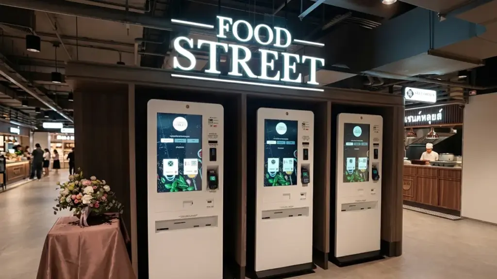
- Point-of-sale (Pos) 端子 and transaction kiosks (例えば, 発券業務, チェックイン) that are focused on text legibility, シンプルなアイコン, and reliable touch input.
- General-purpose education and corporate meeting room displays where most content, such as slides and web pages, is created and viewed entirely within the sRGB space.
Trade-Offs Between Color Performance, 料金, と明るさ
Achieving peak brightness, the widest color gamut, and low cost in a single display is impossible. Every design choice is a trade-off tailored to a specific application and environment.
How Color Gamut Affects Brightness and Power Efficiency
Pushing an LCD’s color gamut to DCI-P3 levels with technologies like Quantum Dot (QD) films often comes at the cost of optical efficiency. These films filter light more precisely to create purer colors, but this process can block some light, forcing the backlight to work harder—and use more power—to hit the same brightness target. OLED displays produce a wide color gamut natively, but they face their own limitations. Their sustained full-screen brightness is typically capped at a modest 150-250 nits due to thermal and power constraints that prevent the organic materials from overheating.
On the other end of the spectrum, high-brightness LCDs designed for outdoor use (>1000 nit) can compromise color accuracy. Cranking up the backlight to extreme levels can cause light to leak or scatter within the panel, which effectively washes out or desaturates the colors. This forces a fundamental choice: prioritize vibrant, accurate colors for controlled indoor environments (OLED/QD-LCD) or raw, full-screen brightness for outdoor readability (high-brightness LCD).
Comparing Display Technologies: LCD vs. OLED
For applications demanding high sustained full-screen brightness, such as industrial panels and outdoor kiosks, LCD technology is the more cost-effective solution. The manufacturing process is mature and scales well for producing very bright backlights. 対照的に, OLED technology delivers far superior contrast with true, absolute blacks and a greater color volume for HDR content. This visual punch comes with a higher panel cost and limited readability in direct sunlight.
Their power consumption profiles are also fundamentally different. An LCD’s power draw is fairly constant, dictated almost entirely by its backlight, regardless of the image displayed. An OLED’s power draw, しかし, scales directly with the content’s brightness (known as Average Picture Level). For battery-powered devices, an OLED display paired with a dark-mode user interface can be significantly more energy-efficient. Yet for systems that display bright, static UIs for long periods, an LCD provides more stable and predictable power consumption.
Impact of the Optical Stack and Cover Glass
The layers on top of the display panel play a huge role in its final performance. オプティカルボンディング, which uses an adhesive to eliminate the air gap between the display and the cover glass, dramatically improves contrast and perceived brightness in ambient light. It’s a process that adds cost but can make a standard panel perform like a much brighter one outdoors. 反射防止 (AR) coatings also enhance outdoor performance by reducing surface reflections, allowing colors to appear more vibrant. This treatment adds another cost layer and can introduce a slight color tint if not engineered carefully.
アンチグレア (AG) treatments are another tool, diffusing harsh reflections to improve readability. The trade-off is a potential reduction in image sharpness and a slight muting of color saturation. When engineered correctly, a complete optical stack can improve 日光の読みやすさ so much that it allows the use of a lower-nit panel, ultimately saving both system cost and power.
Balancing Performance Targets and System-Level Cost
Attempting to achieve both high brightness (>1000 nit) and a wide color gamut (>95% DCI-P3) in one display will significantly inflate the bill of materials (BOM). The panel itself is more expensive, and it requires a more powerful driver and robust thermal management to operate reliably. For many cost-sensitive indoor applications, a standard sRGB LCD running at 250-350 nits provides the best balance of performance and economy.
In mission-critical outdoor systems, investing in optical stack enhancements like optical bonding and AR coatings often provides a better return on investment for usability than simply specifying a wider-gamut panel. The final system cost is determined by the entire assembly—not just the panel, but the drivers, cooling solutions, and the optical stack required to make that panel perform as intended in its target environment.
How B2B Buyers Should Assess Color Specs Realistically
Stop relying on simple gamut percentages. Real-world performance depends on color volume, uniformity, 視野角, and testing the final integrated product, not just the bare panel.
Differentiating Between Gamut, Volume, and Perceived Brightness
A display’s color gamut, often advertised as a percentage like “% sRGB” または “% DCI-P3,” only defines the 2D range of reproducible colors. This metric is incomplete because it completely ignores luminance, or brightness. A far more useful specification is color volume, which incorporates brightness to create a 3D model of a display’s capabilities. Research consistently shows that color volume correlates much better with perceived display quality than gamut area alone.
For wide-gamut displays, you need to dig deeper. Ask vendors if their measurements and calibrations use modern color appearance models like CAM16. These models account for the Helmholtz-Kohlrausch effect, where highly saturated colors can appear brighter to the human eye. Without this, brightness specs for vibrant colors can be misleading.
Inspecting for Color Accuracy and Uniformity
Color accuracy is measured using the ΔE2000 (Delta E 2000) metric. A lower value indicates a closer, more accurate match to the source color. For any professional application, you should request this data. A wide color gamut is useless if the colors it displays are inaccurate.
Just as important is uniformity. Demand specifications that guarantee color and brightness consistency across the entire screen. Inconsistent uniformity results in visible blotches or color tints in different areas of the display, which looks unprofessional and can affect usability. Don’t rely solely on data sheets; incorporate visual inspection into your acceptance testing. An automated test might pass a screen that has an obvious greenish cast or visible banding that a human eye would immediately reject.
Analyzing Off-Axis Performance for Multi-User Environments
If the display will be used by multiple people at once—think of interactive kiosks, medical carts, or collaborative smart displays—its off-axis color stability is a critical factor. The image quality directly in front of the screen means little if it degrades for everyone else. Assess how both color and contrast shift when the screen is viewed from angles like ±30° and ±60°.
Prioritizing stable 視野角 ensures that crucial information remains legible and brand colors stay consistent for every user, regardless of their position. This is not a “nice-to-have”; it’s a fundamental requirement for any shared-use touch display.
Accounting for the Entire Touch Stack and Operating Environment
A panel’s datasheet specs are often measured in a lab under ideal conditions. This is not the reality of a finished product. Insist that all color and brightness specs are measured on the final, integrated assembly. This includes the touch sensor, the cover glass, and any coatings applied to the surface.
Specialty coatings like anti-glare, anti-fingerprint, or privacy filters can significantly reduce effective brightness and shift the color balance. You must also specify and test the display’s performance under your expected ambient lighting conditions. A screen that looks great in a dark room can become washed out and unusable under bright retail lighting or near a window, making its impressive color specs irrelevant.
Why Touchwo Matches Panel Selection to Project Goals
We don’t just sell screens; we solve visual challenges. Our panel selection aligns color gamut, 料金, and optical properties directly with your project’s real-world needs.
Aligning Visual Performance with Application Needs
Not every application needs cinematic color. For a point-of-sale terminal or an industrial controller, the primary goal is clear interaction. An sRGB panel with high legibility gets the job done without unnecessary bells and whistles. 対照的に, retail and digital signage displays require wider gamuts like DCI-P3 to create vibrant, eye-catching visuals that reinforce branding and attract customers.
For highly specialized fields, the requirements become even more stringent. Medical imaging or professional design work demands panels with exceptional color accuracy, measured by a low Delta E, ensuring that what’s seen on screen is true to life. And for premium media experiences, we pair wide gamut panels with high bit depth (10-少し) to render smooth color gradients and deliver true HDR performance.
Optimizing for Cost and Performance
Better color costs more. Wider color gamuts require more advanced and expensive components, like specialized LEDs or quantum dot films, which directly impacts the total project cost. Specifying a standard sRGB panel for an application where the user won’t perceive the benefit of a wider gamut is a practical way to avoid unnecessary expense.
This targeted approach allows the budget to be allocated to features that deliver real, tangible value for the specific use case. In a harsh industrial setting, that might mean investing in durability or a higher brightness rating. Reserving premium, wide-gamut panels for projects where visual quality directly drives user engagement or sales ensures a positive and justifiable return on investment.
Ensuring Consistency with Content and Devices
Most web and application content is created in the sRGB color space. Using a wide-gamut display without proper color management can make this content look unnaturally oversaturated. Matching the panel to sRGB prevents this common problem. In environments with multiple screens, like a command center or a video wall, using panels with a consistent gamut is critical to avoid jarring color mismatches between adjacent displays.
The goal is to display visuals as the creator intended. This means aligning the panel’s gamut with the source content, such as using a DCI-P3 panel for cinematic video. For projects that require versatility, we can select panels that offer selectable gamut modes, such as an sRGB emulation mode on a wide-gamut display, providing flexibility to handle different types of content accurately.
Integrating Touch Technology Without Compromising Optics
A display panel is just one component in the final product. The selection process must account for how the entire touch stack—including touch layers, cover glass, and optical bonding—can alter the perceived color and contrast. Each layer can introduce some degree of optical loss.
We anticipate this by choosing a panel with sufficient brightness and contrast to compensate for these effects, ensuring the final product is bright and clear. さらに, any anti-reflection or anti-glare coatings are carefully matched with the panel’s properties to maintain color fidelity in the target environment’s lighting conditions. This holistic approach ensures the final integrated touch monitor meets the visual performance specification, not just the raw panel out of the box.
最終的な考え
Choosing the right color gamut for a commercial touch display is about matching display performance with the actual application requirements. While wider color spaces such as DCI-P3 provide richer and more vibrant colors, they are not always necessary. For many industrial HMIs, POS端末, and information kiosks, a well-calibrated sRGB display can deliver accurate, consistent, and cost-effective performance.
で タッチウォー, we help customers select touch display solutions based on the complete visual system, including panel technology, color performance, 光ボンディング, brightness requirements, and application environment. Whether you need a standard industrial touchscreen or a customized display with specific color requirements, our engineering team can help configure the right solution for your project.
よくある質問
What is color gamut in a touch display?
Color gamut refers to the specific range of colors a touch display’s screen can reproduce. It is typically measured as a percentage of a standard color space, such as sRGB or DCI-P3. A wider gamut allows the display to show more saturated and vibrant colors.
What is the difference between sRGB, NTSC, and DCI-P3?
sRGB is the standard color space for web content, ensuring color consistency across most devices. DCI-P3 is a wider gamut, offering about 25% more colors than sRGB, which is ideal for HDR content and cinema-quality video. NTSC is an older television standard now used primarily as a marketing reference; 例えば, 72% NTSC coverage is roughly equivalent to 100% sRGB.
Does a wider color gamut matter for commercial displays?
はい, but its importance depends on the application. For high-impact commercial displays in retail or advertising, a wide gamut like DCI-P3 makes brand colors look more vivid. For informational or transactional kiosks, a standard sRGB gamut is often sufficient, with brightness and durability being higher priorities.
Which color standard is best for digital signage?
For high-impact visual content, DCI-P3 is the best choice as it allows for more vibrant brand colors. しかし, sRGB remains the safest and most compatible standard for informational signage or when content is sourced from the web, as it prevents oversaturation and ensures consistency across different screens.
How should buyers compare color specs on touch displays?
Buyers should compare specs by first matching the color gamut (例えば, % sRGB or % DCI-P3) to their primary content. 次, check for color accuracy, often shown as a Delta E (ΔE) value, where a lower number is better. ついに, consider panel uniformity, 視野角, and the availability of pre-calibrated color modes.
Does wider gamut always mean better image quality?
いいえ, a wider gamut does not automatically guarantee better image quality. Without proper color management, it can make standard sRGB content appear oversaturated and unnatural. True image quality results from a balance of gamut, 色の精度, 対比, and panel uniformity. An accurately calibrated sRGB display can look better than a poorly managed wide-gamut display.